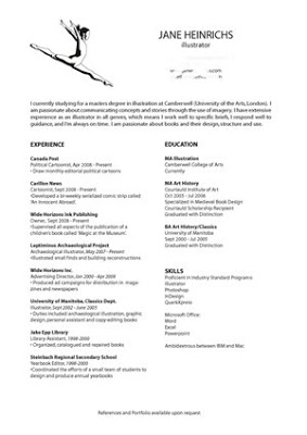
Designing a creative CV

Writing a successful CV for the creative industries is different from most other industries. A well-designed CV is the first impression a future employer will get of you, your style, and your methods of working. It is your first opportunity to market yourself.
This blog post is not about the content of your CV, as there are a plethora of internet articles about what to include (personal details, education, work experience, hobbies, references, power words, etc). Rather, this article is about creative design and how to tailor your CV to your own particular style.
Branding is one of the strongest propaganda and marketing tools available. A well branded CV is the first taste of your style an employer will receive, and you need to convince him or her that seeing the rest of your portfolio would be worthwhile. A branded CV creates an image of value.
How to design your CV
There is no universal blueprint for how to design your CV, as it must be very personal to your industry, your skills and your goals. However, a successful CV will always have the following qualities:
- has visual impact to attract employers attention
- reflects your personality and strengths
- fits the industry, organization, and job requirements your are targeting
- demonstrates that you have the required skills
Employers in different industries will be looking for different types of presentation and content. You may need to change the content of your CV for every job you apply to, as it is important to design your CV with a specific employer in mind.
Layout and Design
The layout of your CV is as important as the contents in the creative world. If it doesn't grab your potential employers attention immediately, it may not be read at all. You are telling a visual story of why an employer should hire you and giving them a first glimpse of your portfolio. Pull out the stops and use all your talents!
Type:
You should use layout and typography to make sure the contents are easy to follow and lead the reader's eyes directly to the most important points. To do this you can play with size of type, colour of type and spacing. Be consistent with your font styling. If certain headings or skills are emphasized in bold, for example, the reader will expect all important things to be consistently highlighted.
Images:
You may want to highlight your creativity and innovation by including images in the design of your CV. If you integrate them well, they will make your CV stand out and instantly show the employer your skill and abilities. If you do this, you need to ensure the visuals compliment the overall look of the CV.
Length:
Your CV shouldn't be more than two pages. If it is, make sure it is only one page double-sided and that you put the most important information on the first page. Place the various sections in an order that will highlight your strengths.
Make sure it photocopies well, and is easy to email.
Examples of creative CVs
To see examples of award winning CV design, click